
It’s the year 2020, and by now website animations are certainly not a novel idea. We’ve evolved from the days of scrolling marquees and dancing hamsters, to more sophisticated, less pixellated web animations. And of course you want elements on your website to move – it’s engaging, it’s cool! Let the drop-downs unfurl, the photos careen in from off-screen, and the “x” close button on that pop-up do a little somersault. But as is the case with many aspects of design, when it comes to animations on your website, less is often more.
It’s important to carefully consider which elements on your site should animate. If everything moves, users can become confused, overwhelmed, or annoyed. Here are three questions to ask of your website animations:
Does the animation convey importance?
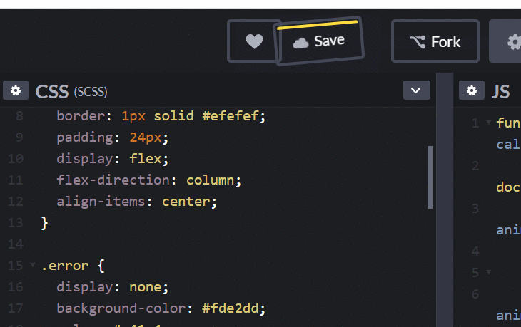
If everything is important, then nothing is. Animation can be a useful tool for drawing users’ eyes to the elements or information they need to pay attention to. An example of this can be seen here. We want the user to quickly notice that an error has occurred, so we attract their attention with a small shaking movement.
Ironically, as I was writing this in CodePen, CodePen utilized the same concept: the “Save” button shook periodically to remind me that I hadn’t saved my work!
Does the animation communicate your brand?
Animations can do so much more than just “look cool”! If you’re adding animations to your site simply for the sake of seeming on-trend, you might be missing a powerful branding opportunity.
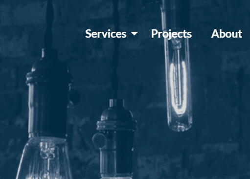
Different animations have different spirits. Some are cute, some are goofy, some are graceful. Consider what aesthetic your brand should express, and then review your website’s animations to decide if they’re delivering.
Does the animation help the user to understand what’s happening?
One of the most important (and overlooked) ways that animations can improve a user experience is by helping your users make mental connections. By animating a drop-down menu to slide open from its parent, instead of just appearing out of thin air, you’re telling the user: this sub-menu’s information is related to the parent menu item.
This is a very simple example, and certainly most users would be able to figure out how a sub-menu related to its parent without any animation. But we can apply the same concept to other, less familiar user interfaces, and save our users many small mental efforts throughout their use of our products.
Use your animations wisely
With these three questions, you can ensure that your website’s animations are pulling their weight!
Don't Branch Out Alone
We know that your time is limited but taking your website to the next level is essential. Don’t branch out alone. Tap into our team of experts to keep your site ahead of the curve.
Let Us Help