This week, we’re continuing our article series on eCommerce, and this includes our previous post on eCommerce Website Design Trends.
A call to action (CTA) may be the most important aspect of an eCommerce site, and it’s certainly very important when it comes to eCommerce web design services. The CTA is ultimately what drives them to purchase your product.
Make sure your CTAs are snappy yet get the potential customer to stop and think about why they want your product instead of anyone else’s. Here are some examples of clear and impactful CTAs from Eat PowerSnacks! that will help you when you’re looking at the calls to action on your eCommerce website.
Hero CTA
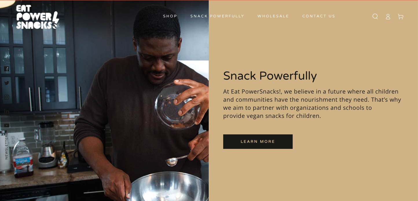
Even though people don’t know whether or not they want to purchase your product based on the information in the hero, it’s a good idea to have a call to action there.

Why? People want a quick way to learn more about your product, and having a call to action in the hero is the simplest way to do so. The Eat PowerSnacks! website does a great job of this, because that “Learn More” CTA takes you right to the Snack Powerfully page, which gives information about the founders and why they started the company.
If you’re interested in going more in-depth, read our recent article on the Best Heroes for eCommerce Website.
Add to Cart CTA
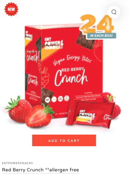
On any eCommerce website, it’s important to give users the option to add your product to the cart. This is, after all, part of the main reason that they are on your website, so it’s best for both you and your potential customers if there is an easily accessible “Add to Cart” button.

It’s one of the eCommerce homepage best practices for the cart to be visible at all times (on every page as well – not just the homepage), so customers know what products they have, and to make sure they don’t accidentally order duplicate products.
Your Story CTA
I’ve said this before, but it’s very important: People want to know why they should buy from you and what sets you apart from your competitors.
What’s your story? What do you do that no one else does?

For Eat PowerSnacks!, there’s a few things that set them apart from their competitors. This call to action brings you to their Snack Powerfully page, where you can read more about their mission. Eat PowerSnacks! finds value in community and the future leaders that live in those communities, and the food insecurity that they face.
This is why Eat PowerSnacks! gives 5% of their profits back to those communities, to help with diminish food insecurity in those communities.
They are committed to diminishing food insecurity and are doing something about it, which is another great reason to purchase from Eat PowerSnacks!.
Newsletter & Social Media Call to Action
If someone is interested in purchasing your product, chances are that they will also want to check out your social media and/or newsletter. They want to see what your brand’s style is outside of the website, and this also gives them an opportunity to look at your latest products.
This is why it’s important to have social media links and newsletter sign-ups on your website in a convenient spot on your website. (And, also, a reminder that it’s important to keep your social media channels as up to date as possible!)
![]()
On the Eat PowerSnacks! website, they have a sidebar where you can browse their different social media channels, as well as a button to sign up for their newsletter. This gives potential customers the opportunity to browse their social media and an easy way to get newsletter updates.
Conclusion
When it comes to your eCommerce website, it’s important to feature various calls to action. This article features only a fraction of eCommerce call to action examples that can appear on your website.
If you liked this article and want help for your eCommerce website, contact us.
Don't Branch Out Alone
We know that your time is limited but taking your website to the next level is essential. Don’t branch out alone. Tap into our team of experts to keep your site ahead of the curve.
Let Us Help