This week, we’re continuing to talk about eCommerce, from our previous topic of Best Heroes for eCommerce website.
When a user clicks onto your eCommerce homepage, they want to know why they should buy from you over any other brand. They may not realize that’s what their goal is, but it’s true. So, you want to give them the resources they’ll need in order to convert (purchase your product), in addition to giving them reasons as to why they should buy your product over other, similar products.
This is where eCommerce homepage best practices come in. It’s important to showcase your brand to your potential customers, and there are a few ways to do that.
Brand Specifics
Let’s look at Eat PowerSnacks!, a vegan and family-friendly energy bar. There are several things that set Eat PowerSnacks! apart from their competitors, and we’ve made sure to highlight these differentiators on the homepage.
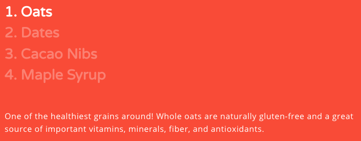
First, Eat PowerSnacks! is made for kids by dads, so a lot of care went into the ingredients and making sure these energy bars are something kids want to eat. This does a good job of setting them apart from their competitors.

Second, the Eat PowerSnacks! energy bars are made with only a few ingredients, and these ingredients are listed right on the site. When you click over to buy a box, those ingredients are also listed right there on the page. Again, this is great for setting Eat PowerSnacks! apart from their competitors because the products really are as simple as they say on the package, and that is not the case with a lot of products.
Work With Your Customers
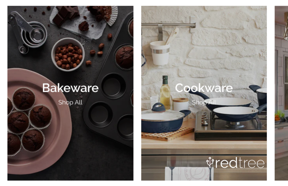
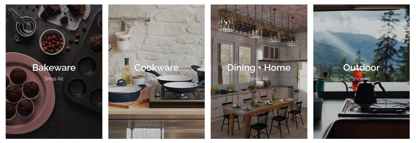
Let’s move on to our next brand, Berry + Basil, a kitchen and specialty food store that curates specific products. Their individual products combine with each other and work well together.
One of Berry + Basil’s differentiators is that they work with their customers to figure out how they can get Berry + Basil’s products to their home. This shows how dedicated they are to their customers.
Their homepage also has links to each section of their website for easy access to their products right from the homepage, making it simple to browse and choose products. They’ve also included their top brands, which link to that brand’s page on their website. In addition to these, they also have sections on their homepage that lead to their Events page, the Visit Us page, and the About page. All of these set them apart from similar brands because you can visit multiple important sections of their site right from the homepage.
Science + Safety
The Safety Sleeper®, which are safety beds for special needs children, combines science and safety. These beds are scientifically proven items that have been thoroughly thought out and tested, and are designed to keep your loved one safe. The Safety Sleeper® sells one product in three separate versions, and they’ve made sure that it’s an exceptional product for families that want to keep their loved ones safe.
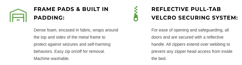
After the hero, the next section of the homepage talks about the different features of The Safety Sleeper®, from the frame pads & built in padding to the wheeled suitcase. Then, the different models of The Safety Sleeper® are presented, giving information for the user as well as the option to purchase. Next, there are resources from an expert, who will help you decide the best bed for your loved one. This information helps anyone that was unsure about the product become more confident in their decision to purchase.
Conclusion
When it comes to eCommerce homepages, it’s important to give your users the information they need in order to make the best purchase for themselves. If you want help with the design of your site, we help with eCommerce web design services.
Don't Branch Out Alone
We know that your time is limited but taking your website to the next level is essential. Don’t branch out alone. Tap into our team of experts to keep your site ahead of the curve.
Let Us Help