Let me preface this design post by conveying to my audience that the following thoughts are based on A LOT of web surfing and article reading, but are by no means backed up with a works cited or bibliography that expresses any truly thorough research.
The past few years, websites followed the lines of minimalist clean designs that implement grids with colors that aren’t too bright and fonts that are thinner and less imposing, both concepts used to subtly enhance the simplicity of the layout. Now it’s 2017, and some of those design trends are taking on new turns. There are three aspects in particular that were obvious when looking around the Internet.
Typography
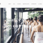
Typography within any form of design is important and a visually obvious aspect in terms of recognizing changes in trends. Interesting, fun typefaces are making a come back within the platform of web design. Sans serif fonts are seen as being a bit more romantic or fancy in nature, and there has been an increase of san serif’s being used in prominent headings. In addition, combinations of sans serif and serif fonts with more character and drama in their forms are being used for new sites.
 There just needs to be a conscious effort from designers not to cross the line from elegant and interesting to kitschy. The website should utilize new trends within type to a degree where they are relevant within current design standards, but will not fall too quickly from the precipice of on trend to outdated. There needs to be a balance of new with classic.
Color
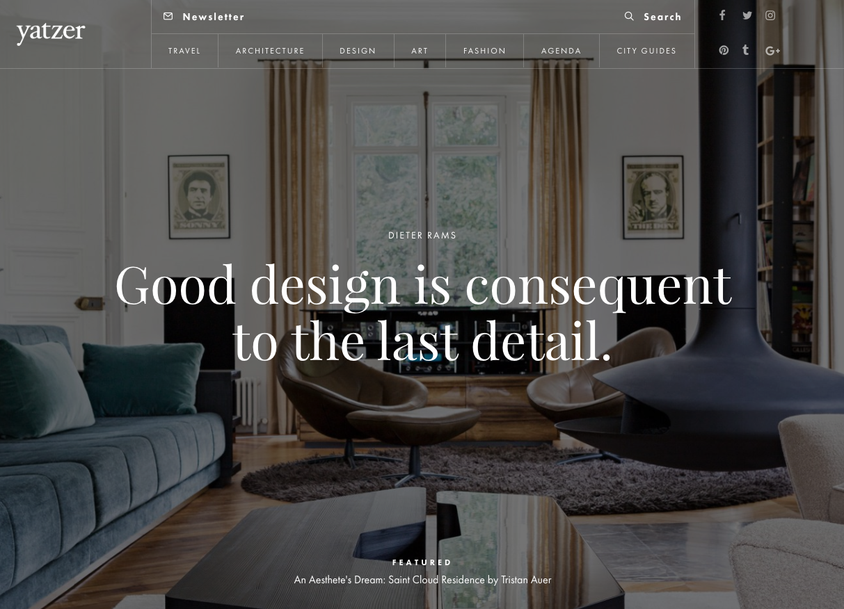
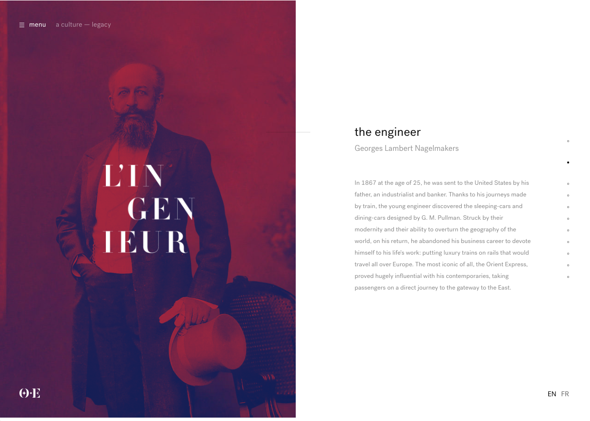 The use of color to create drama and call attention has always been a thing within design. In recent years, bold color has taken a backseat to subtle colors being used to issue gentle compliments as opposed to screaming in order to be seen. However, recently the inclusion of bright color here and there in order to highlight important content or design is trending. There are also examples of the use of large amounts of bright color or gradients to stick out, like the DOT website. The Pantone color of the year is the epitome of the direction colors are taking. 2017 has deemed a bright fun green aptly named Greenery as the example by which we designers should follow.
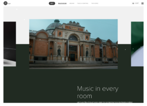
Layout
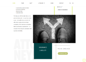 Typography and color are being utilized in the overarching design concept of layout, more specifically, dynamic design. The use of traditional grids and clean linear design is being bent a bit more towards chaos. Balanced asymmetry and playing with strict grids is being seen more and more.
 The use of subtle transitioning and animations is also common amongst 2017’s current sites. As opposed to dominant dramatic animations that are the focal point of a site, the diverse yet simple transitions and animations being referred to in this post are more about creating design cohesion that enhances the content instead of overwhelming it. I find that outside of projects for artistic expression, tolerance is limited when viewing long animations or scrolling through animations that do not pointedly and consistently express the purpose of the website content.
These design trends may not ring true with all designers, this is an interpretation based on one persons observations (and may possibly be swayed by my aesthetic), so as with all ideas, discussion is encouraged!
Don't Branch Out Alone
We know that your time is limited but taking your website to the next level is essential. Don’t branch out alone. Tap into our team of experts to keep your site ahead of the curve.
Let Us Help