
One of the most important aspects of UX web design is the navigation. This is typically found at the top of the website, the menu with all of the important information about a company: About Us, Products/Services, a Contact form, etc.
The navigation is a big part of the user’s journey; if someone comes to your website, they have a reason.
They are looking for a few things:
- a product or service
- answers or insights to their problem
- a way to contact you
If users cannot find what they are looking for, they will lose trust in your brand. When users lose that trust, they get frustrated, and will hit the dreaded “back” button to exit your site and go to your competitors’ website instead.
Let’s go through two website navigation examples to make sure your site’s navigation has all of the necessities yet is still easy for people to use.
berry + basil
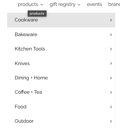
berry + basil is a shop that curates products based on their customer’s needs, and the navigation at the top of their site reflects that.

Let’s say that you’re looking for a pie dish. If you hover over Products, you’ll be presented with a dropdown, with several product options that include Cookware, Bakeware, and Kitchen Tools.
Since we’re looking for a pie dish, we’ll hover over Bakeware, where a list of options will expand out within the navigation. The expanded list of products allows you to see all options at once, making it easier for you to find what you’re looking for.
And there it is, first under Baking Essentials: Pie Dishes + Tart Pan.
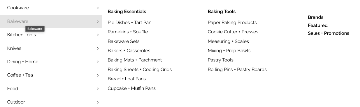
If you have a lot of products on your site, a great way to showcase them is using this type of navigation. It’s easy to find what you’re looking for, even though there are a lot of different products.
The Safety Sleeper®
The Safety Sleeper®, which is a medical enclosed bed, has an effective two-tiered navigation with a primary and secondary menu. The navigation is in two parts:
- A top row, next to the logo, with Resources, About information, and a few eCommerce essentials, such as an icon that shows what’s in your cart.
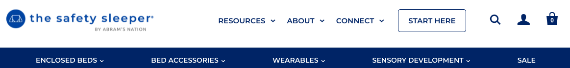
- A bottom row, the blue one with white text, which is where the products are located.
There’s a lot of important information on The Safety Sleeper® website, and it’s necessary that it is presented in a user-friendly manner.
Without proper organization, users may feel overwhelmed by the sheer volume of content, potentially leading to frustration and site abandonment – a scenario we aim to avoid.
Implementing multiple levels of information is a smart way to design ourwebsite’s navigation, especially when we have a lot to share.
Conclusion
These are only a few website navigation examples that will fit in line with your business’s brand, and as you look through your site, ask yourself:
- Is the navigation intuitive?
- Does the navigation support user goals—making a purchase, finding information, contacting the brand?
- Does the navigation adapt well to mobile devices?
- Is there good hierarchy/key information accessible?
- Can the navigation menu evolve as the brand’s offerings, content, or priorities change over time?
Contact us if you’ve answered no to any of these questions; it might be time for a redesign of your website.
Don't Branch Out Alone
We know that your time is limited but taking your website to the next level is essential. Don’t branch out alone. Tap into our team of experts to keep your site ahead of the curve.
Let Us Help