
We love great corporate websites. Every time we see one that strategically blends beautiful design with top-notch functionality, we stop and take notes.
That’s just what we’re passionate about.
And we love helping other companies build beautiful company websites that increase site traffic, boost sales, and drive conversions.
Learn from our observations on the world’s best company websites—an apply them to your own!
Table of Contents
Skip the section most useful to you:
What Makes A Great Company Website?
4 Great Company Websites We Love
The Best Company Websites: Public Edition
The Best Company Websites: Redtree Edition
Find Help With Your Company Website
What Makes A Great Company Website?
Before we get to the best company websites, let’s talk about what makes a great company website great.
Here’s what to look for (and check out our case studies to see these principles in action):
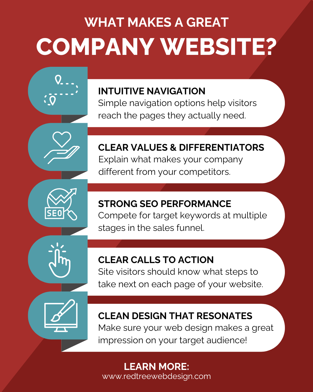
1. Intuitive Navigation
The best company websites have simple, intuitive navigation options that help site visitors reach the pages they actually need while pushing themselves down the sales funnel, which is the buyer’s journey each site visitor goes through on their way to converting into a phone call or email.
With intuitive navigation, your target audience can spend more time on your website, which allows you to build trust before doing business with them.
2. Clear Values & Key Differentiators
No matter what industry you’re in, you have competitors. And your target audience is trying to figure out whether they should work with you or someone else.
Be clear about what sets you apart from the competition. Defining your company’s unique value proposition makes your ideal target audience more likely to do business with you!
We recommend including those differentiators well beyond your About page. You can also include them:
- On your homepage
- On your product pages
- On your service pages
- And on others
3. Strong SEO Performance
Great company websites compete for their target keywords to capture organic traffic at multiple stages in the sales funnel, and that starts with search engine optimization.
Build each page of your website with SEO best practices in mind, which can include:
- Conducting keyword research
- Including a keyword-rich page title, URL, meta description, and H1
- Including your target keyword and second keywords in your on-page copy
To learn more about SEO, check out our professional SEO services.
4. Clear Calls to Action (CTAs)
Your site visitors should know exactly what actions to take when they reach your website. The best company websites have clear contact buttons, contact forms, and opportunities to learn more about your company, products, and services.
You should also have a clear CTA on every page of your website!
5. Clear Design That Resonates With Your Target Audience and Aligns With Your Brand
Your company website should resonate with your target audience with a design that meets their needs while properly representing your brand colors, voice, and values—something we really help companies focus on long-term with BLOSSOM.
To learn more about best practices in this area, check out our UX web design services.
4 Great Company Websites We Love
1. IBM – We love the IBM website for balancing a massive amount of information with a lightweight design.
2. Pela – Pela is a fantastic eCommerce company that has perfected their messaging and online shopping experience.
3. McClintock & Associates – The McClintock & Associates website immediately helps the company stand out from the competition and pushes site visitors down the sales funnel toward a phone call or email.
4. DQE Communications – This is a no-nonsense website that provides a top-notch user experience with a special emphasis on navigation.
Read on to learn more about each website:
The Best Company Websites: Public Edition
Here are two of the best corporate websites from household brands:
IBM
IBM is a massive international company with services ranging from cutting-edge AI technologies to supply chain sustainability.
That’s a lot of ground to cover on a single website.
But IBM handles it with grace. Just look at how neat and tidy that homepage is:

What We Love About It
Here are a few small details that make the IBM website so successful:
1. There’s a ton of information “above the fold.” When you land on the homepage, you have a wide selection of options for navigation, empowering you to choose your own journey without scrolling up and down.
Plus, clicking into the navigation bar reveals a massive mega menu that helps site visitors find the exact topic they’re looking for.
2. There’s a ton of information without being overwhelming. Take another look at that website. On a standard desktop screen, you have 13 unique places to click and drill down further into the site. And on our fancy web developer screens, we have 17 places to click.
That’s a lot of navigation options, but the developer of this website incorporated a ton of “negative space” to keep the entire website easy to view.
And speaking of design…
3. The IBM website embraces the “less is more” maxim. There’s a ton of information on each page, but the designers have used slim icons, soft imagery, and lightweight fonts to keep the site as visually simple and appealing as possible.
There’s a massive amount of information, but it certainly doesn’t feel that way!
Pela
Pela is an eCommerce phone case company specializing in plastic-free cases that keep plastic waste out of landfills.
They’ve placed a special emphasis on being eco-friendly, and they’ve also nailed their online shopping experience.
With some clever design features, they’ve built a terrific user experience.
What We Love About It
We can’t gush about the Pela website enough, but we’ll try to limit it to a few paragraphs:
1. Immediate mission statement and social proof. Pela comes right out of the gate with “Remove plastic from your life…and our planet” (their mission and unique differentiator) and huge trust signals, including “50,000+ 5 Star Reviews” and logos from brands like BuzzFeed and CNN.
2. Continued emphasis on the mission statement. Scroll down the homepage and you’re greeted with an impressive fact: Pela has prevented the equivalent of 48 million plastic bags from going into the ocean. Keep scrolling, and you’ll come back to their message over and over, which helps make shoppers feel good about shopping with Pela.
3. Incredibly intuitive shopping experience. Searching for the right product on the site is a breeze (thanks to their categorizations)—and their cart experience offers add-ons that don’t feel like upsells (which is likely a boon to Pela’s bottom line and website ROI.

The Best Company Websites: RedTree Edition
We don’t like to toot our own horn very often, but here are a couple of websites we’ve built and are especially excited about:
McClintock & Associates
McClintock & Associates is an incredibly specialized firm focusing on financial aid regulations in postsecondary education. Although their list of competitors could fit on the back of a napkin, they have to work incredibly hard to differentiate themselves.

What We Love About It
Here’s what makes this website so special:
1. Their homepage is incredibly clear about their value proposition at the top of the funnel… For people who are checking out McClintock & Associates for the first time, the hero copy on the homepage explains exactly what they offer. And if it seems like you’re in the right place, you can click the “See What Our Experts Have to Say” button to dive deep into the company’s latest blog posts—an opportunity for them to pull you down the funnel toward a phone call or email.
2. …And it’s just as clear at the middle of the funnel.
The “What Makes Us Different” box near the top of the homepage quickly differentiates McClintock & Associates in the market with some of the company’s most impressive stats.
Visit the McClintock & Associates Website
DQE Communications
DQE is a Pittsburgh telecommunications company specializing in network solutions. Their target audience is a no-nonsense bunch who know exactly what they want and don’t desire any sort of fluff.
We designed their website to resonate with them.

What We Love About It
Here’s what makes the DQE Communications website stand out:
1. It gets right to the point. Navigation couldn’t get much easier on the DQE Communications website. The moment you scroll down below the fold, you’re greeted by a menu of service options that allow you to pick where you go next.
2. It constantly pushes to the impressive map feature. This company’s site visitors want to know two things right away:
- Do you offer what I need?
- Is it available in my area?
That’s why the interactive Network Map is so valuable; it helps users quickly determine whether or not DQE Communications’ services are available in their area.
And no matter where you are on the website, the Network Map is only a click away.
Find Help With Your Company Website
Ready to have your own fantastic website? Contact us! We’ll help you decide if you need a complete site rebuild (with our ROOT package) or whether gradual, systematic improvements could be the better way to go (through our BLOSSOM package).
Don't Branch Out Alone
We know that your time is limited but taking your website to the next level is essential. Don’t branch out alone. Tap into our team of experts to keep your site ahead of the curve.
Let Us Help