
Multi-Industry Leader’s Website Overhaul Increases Conversions 1,456%
BACKGROUND
CAI Fast Facts
Industry: Professional Services
Website: https://caiready.com/
Location: Indianapolis, IN
Case Study Date: 2024
THE PROBLEM
Rapid Growth Led to Confusing Websites
CAI is a major leader in the Operational Readiness space, guiding companies in the Life Sciences and Mission Critical arenas to launch, hire, and run more efficiently.
But with its sharp divide in industries, the company actively maintained two separate websites: one for Life Sciences and one for Mission Critical.
Worse, both websites struggled to differentiate the CAI brand and clearly align its unique value proposition with the company’s target audiences—and that contributed to mediocre website performance.
Bottom line: CAI’s websites weren’t driving meaningful results.
Before:

THE SOLUTION
Clearer User Personas, Clearer Website
Alongside our partners at Catalyst Marketing Agency, we completely reimagined everything. We revisited CAI’s target audiences, the objectives of a meaningful website, and the entire CAI brand.
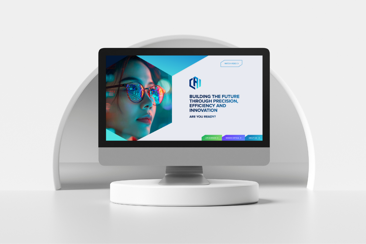
The Homepage
Our initial conversations and research led us to an unusual solution: Instead of relying on two separate websites, we built out distinct webpages for CAI Life Sciences and Mission Critical audiences, then connected them with a simple but elegant homepage.
There, visitors only have four options:
- Watch a video about CAI
- Click to the Life Sciences section
- Click to the Mission Critical section
- Click to learn more about CA
After:


Unique Sections For Life Sciences And Mission Critical
With the homepage carefully designed, we placed a special emphasis on the user journey through both the Life Sciences and Mission Critical sections, ensuring both areas of the website followed appropriate brand guidelines while also feeling unique and focused on the specific target audience.
One of our most important focal points: Speak directly to the audience’s pain points. CAI’s target audience in the Life Sciences and Mission Critical spaces are busy, intelligent, well-informed professionals, so it was critical for us to immediately present CAI as a reliable, results-driven organization.
Our solution: We included results-oriented case studies at the top of the Life Science and Mission Critical landing pages to assure users that CAI is a dependable resource for long-term solutions.
We also played close attention to the navigation options within the Life Sciences and Mission Critical sections, creating additional pathways and pages in the Life Sciences section to address CAI’s additional services in that space.
An Emphasis On Design
Our designers made countless decisions to create consistency through every user journey—while also creating a distinct experience for the Life Sciences and Mission Critical sections.
Some of our most important decisions:
1. Color: Scroll through the Life Sciences-focused pages, and you’ll notice a heightened emphasis on green—a color commonly found in thriving plantlife throughout nature. We also modified the CAI logo in the header of the Life Sciences pages to incorporate that same green, which serves as an indicator of where the user is on the website.
On the Mission Critical pages, however, we relied on indigo—a color associated with harmony and intuition, and one that reflects CAI’s ability to create tranquility and order within complicated systems. As with the Life Sciences pages, we modified the CAI logo on Mission Critical pages, but this time we incorporated indigo.
2. Hexagons: The CAI logo is built within a distinctive hexagon, and we carried that shape and its angles throughout the website.

You’ll notice its inspiration in:
- The angles on the website’s buttons.
- The images throughout the website.
- The cards to help users navigate to different pages
The result, of course, is a unique web experience that emphasizes CAI’s branding and helps it stand out in a competitive market.
3. Navigation: As a team, we discussed at length the merits of allowing users to quickly flip back and forth between the Life Sciences and Mission Critical services, but our research led us to an important conclusion: Most site users only need one section of the website.
With that in mind, we ultimately decided to allow users to switch between industries through the top navigation—but without making this functionality a focal point. Instead, users can focus on the CAI solutions most relevant to them.
THE PAYOFF
Rapid Growth From Fundamental Improvements
In the two months following the site’s relaunching, CAI recorded:
- 1,456% increase in conversions
- 103% increase in site users
- 23% increase in engagement rate
- 5% decrease in bounce rate
Thanks to our enhanced design, the site architecture is much more logical, simplifying the user experience and clearly explaining both what CAI does and their unique value proposition.
More importantly, our heightened focus on CTAs means users are much more clear on what they’re supposed to do on each page, leading to better business outcomes.
Don't Branch Out Alone
We know that your time is limited but taking your website to the next level is essential. Don’t branch out alone. Tap into our team of experts to keep your site ahead of the curve.
Let Us Help