Outside of the navigation, the hero is the first thing a user sees when you first land on a webpage. Looking at a hero doesn’t require you to do any scrolling or clicking onto other pages of the site, which is why it’s called the hero… See where we’re going with this? The hero also ties into the user experience design of the website, because whether or not a user continues on the site can hinge on the quality of the hero.
What to Put in the Hero
Heroes on eCommerce sites have two main goals: validate that the user is in the right place, and pique their interest so that they engage (via scroll, click, staying on the page for more than one second). This means that, from the very beginning, there are three ingredients that every hero should include: brand differentiators, concise and clear copy, and the call to action (CTA).
Brand Differentiators
The hero is a quick snapshot into your business. It gives users insight into why they should purchase your product and, perhaps most importantly, what sets you apart from your competitors. Why should users buy from and trust you over anyone else that sells your product?
This is why it is important to include your brand differentiator inside of the hero. Make sure to be subtle about it; in the hero, you don’t need to come right out and tell your users, “hey, this is our brand differentiator!” They’ll decide after reading whether or not they want to continue through the site.
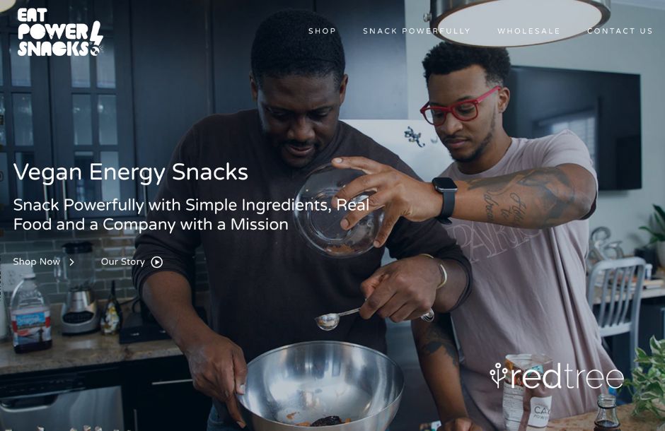
For this first example, let’s take a look at Eat PowerSnacks!, which are vegan and kid-friendly energy bites.

One of Eat PowerSnacks!’s brand differentiators is that they strive to eliminate food insecurity and utilize simpler ingredients, and this is evident based on the text inside the hero: “Snack Powerfully with Simple Ingredients, Real Food and a Company with a Mission.”
There’s also this extension of the hero, which gives more insight into the brand, who they are, and the audience they want to reach.
This hero works because users get a sense of Eat PowerSnacks!’s brand differentiator with only a few sentences.
Copy That Connects
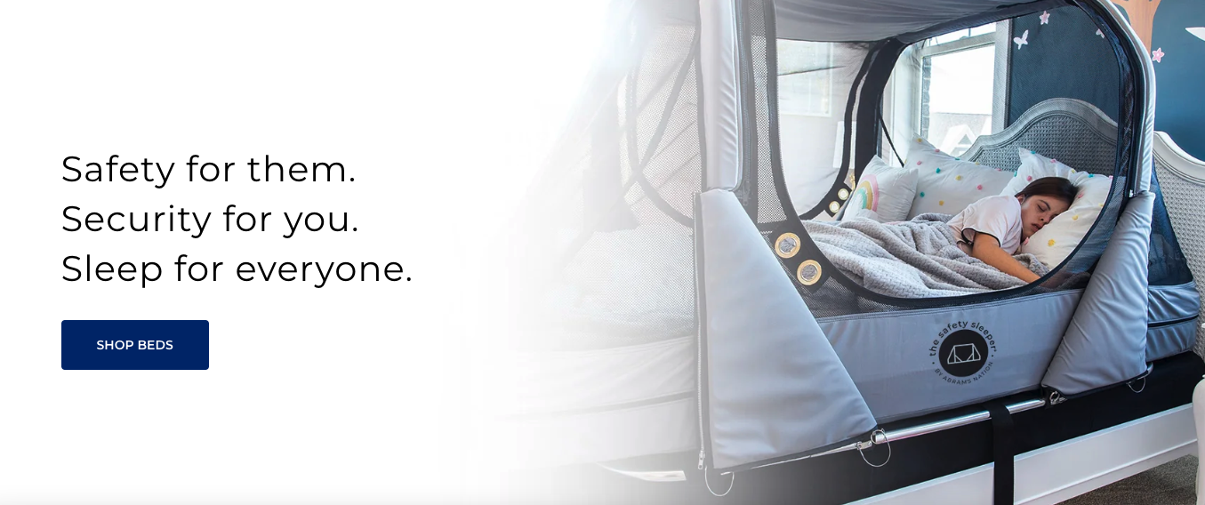
Another thing to look out for in heroes is concise and clear copy, which lets you know you’re in the right place because you want a company to understand the problem you are solving and how to provide a solution. The Safety Sleeper®, safety beds for special needs child, by Abram’s Nation, which provides enclosed safety beds for adults and children with special needs, gets their brand differentiator across with only three three-word sentences. “Safety for them. Security for you. Sleep for everyone.”

This hero works because it guides the user to shop for The Safety Sleeper® without requiring them to scroll. It also connects potential customers and the target audience to the brand’s differentiators.
Call to Action (CTA)
There are ways to capture an audience’s attention without even using words, and the hero for Berry + Basil, a kitchen store that offers products curated to your needs, does that. If you hover over the dots on each product, you’ll get more information: what the product is, how much it is, and a link to view more about it.

This hero works because it gets people interested in the product and provides a call to action that stands out to the user in a way that also showcases the brand’s differentiators: that they curate products based on your needs.
Conclusion
The hero section of a website serves as a visually impactful and informative introduction, aiming to captivate visitors, communicate essential messages, and guide them towards further site exploration or desired actions. We do ecommerce website design and development in Pittsburgh, so if you’re looking for an agency to help redesign your site, contact us for more information.
Don't Branch Out Alone
We know that your time is limited but taking your website to the next level is essential. Don’t branch out alone. Tap into our team of experts to keep your site ahead of the curve.
Let Us Help