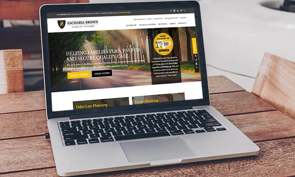
In 2016, RedTree completely redesigned Zacharia Brown’s website.
Four years later, it was time for a refresh.
GOAL | A More Helpful Homepage
Zacharia Brown had outgrown their homepage in a number of ways: they were utilizing it to display all of their upcoming events, which resulted in a long scroll of text, and their number of locations didn’t fit neatly in the area originally designed. Additionally, they weren’t seeing as much traffic to their service pages as they would’ve liked, and they wanted to showcase client testimonials on the homepage. All of this called for a reimagining of the homepage structure and content.
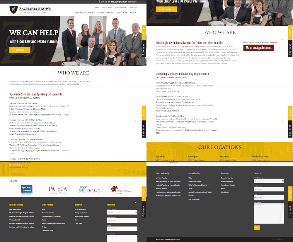
Before: A long list of upcoming events, locations wrapping to two lines, and no clear direction to the service pages.
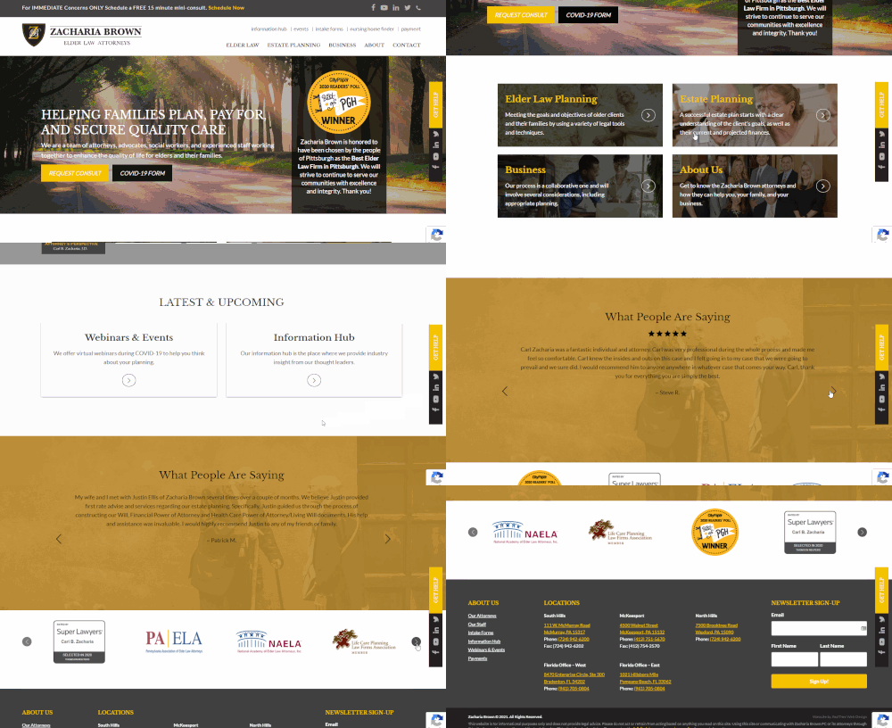
After: We've made it very clear how to find the next page you might be looking for, and instead of listing out upcoming events, we provide secondary actions the user might want to take: view upcoming events or browse the information hub. This homepage provides even more information than the old one, but in a much more concise, easy to navigate way.
GOAL | Create an Information Hub
As Zacharia Brown started to expand the quantity and types of content they produced, they began to outgrow their blog. The different types of resources were being spread out across the site, which made navigation unwieldy and the information hard to find. Articles, videos, and gated webinars needed to be housed in the same area, while being easy to identify and filter each.
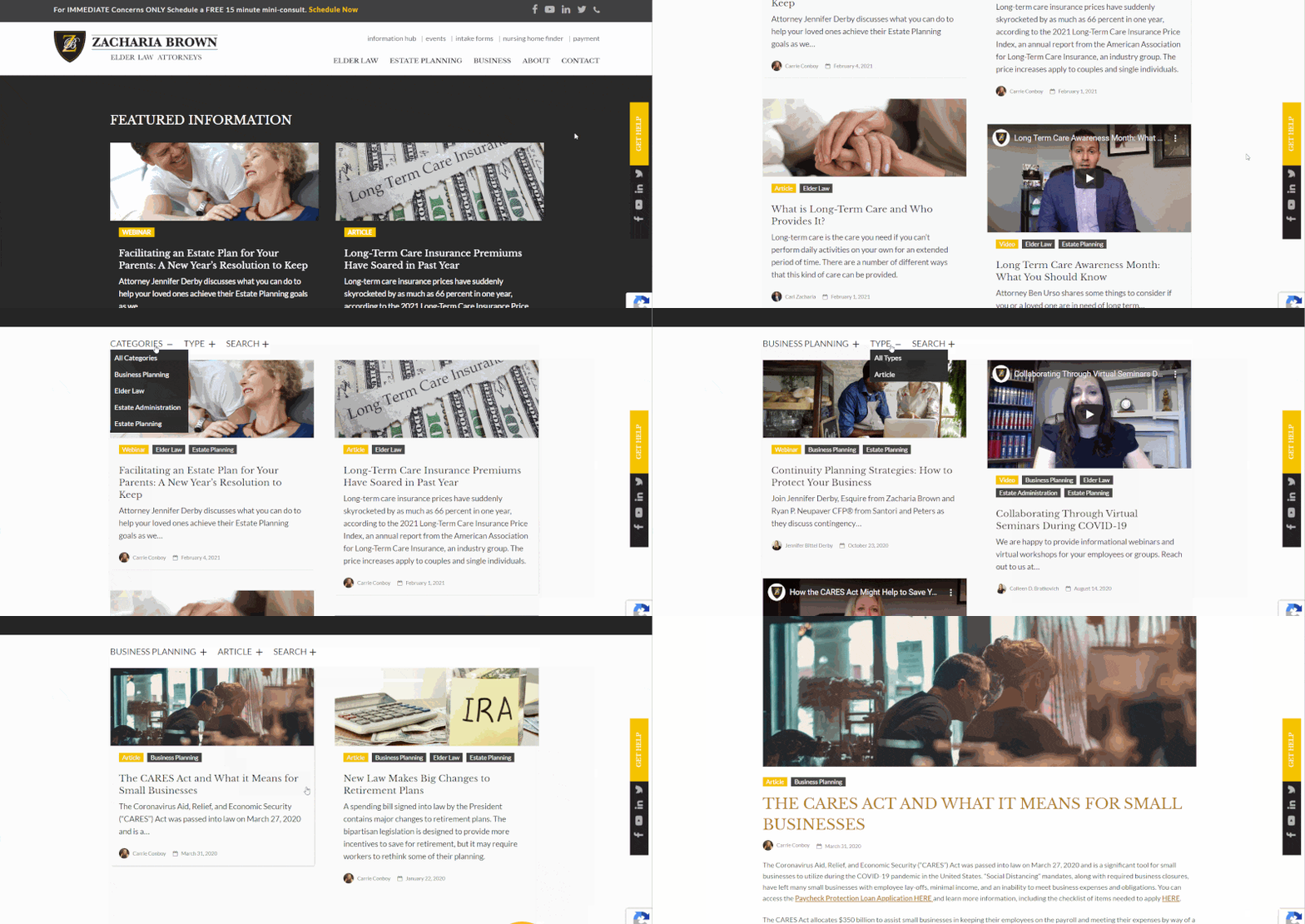
Now, all of Zacharia Brown's varied content lives in one place, and is easily sorted.
GOAL | Showcase Their Talent
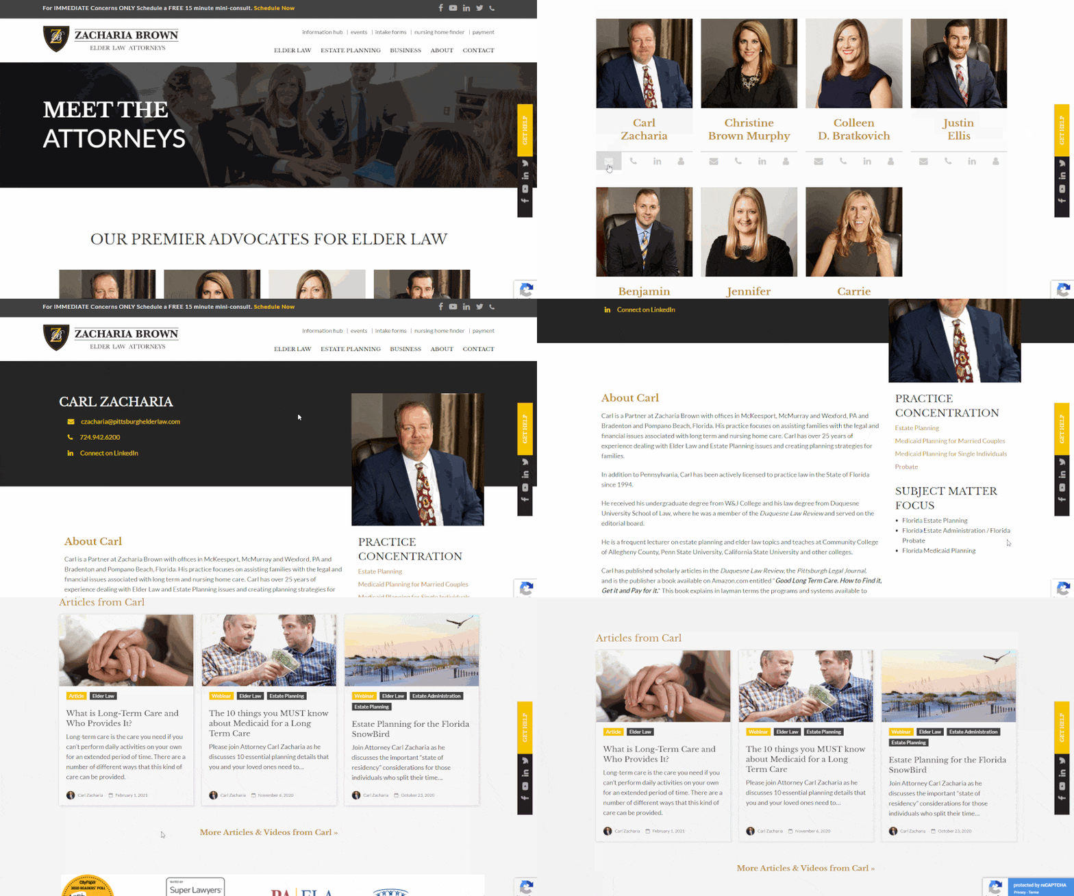
To accompany all of the new content being produced by their attorneys, Zacharia Brown needed enhanced attorney biography pages that could:
- Display articles and videos by each attorney
- Showcase an attorney’s practice concentrations and subject matter focus
- Be easily updated and maintained
GOAL | Digitize Client Forms
Last but certainly not least, in the wake of COVID-19, Zacharia Brown was looking for ways to streamline and digitize their processes. One of the biggest opportunities for improved efficiency was to bring their paper client intake forms online.
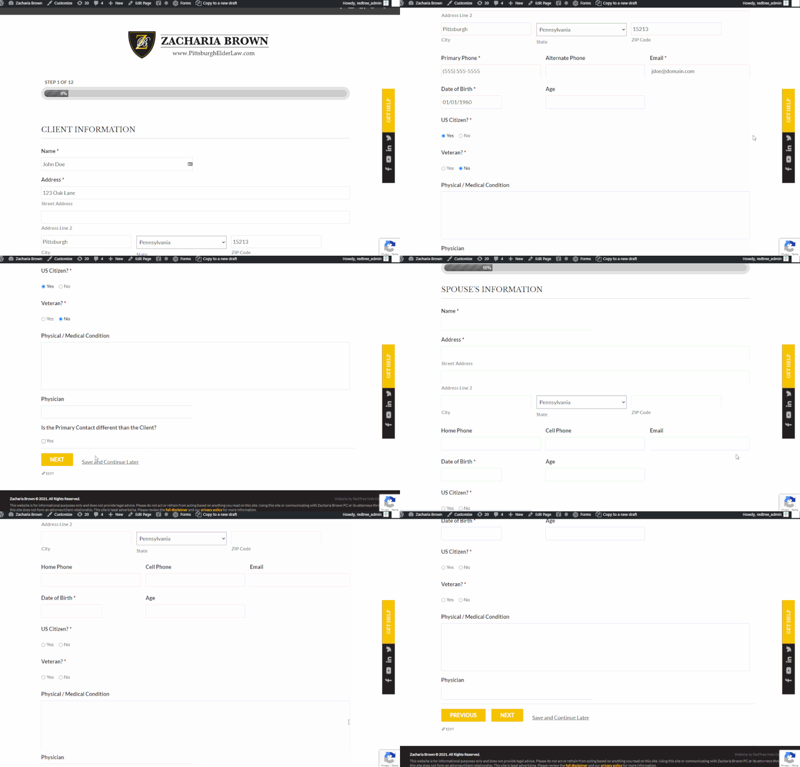
These intake forms are made up of multiple pages, and they allow the user to save their progress and resume filling them out later.
Don't Branch Out Alone
We know that your time is limited but taking your website to the next level is essential. Don’t branch out alone. Tap into our team of experts to keep your site ahead of the curve.
Let Us Help